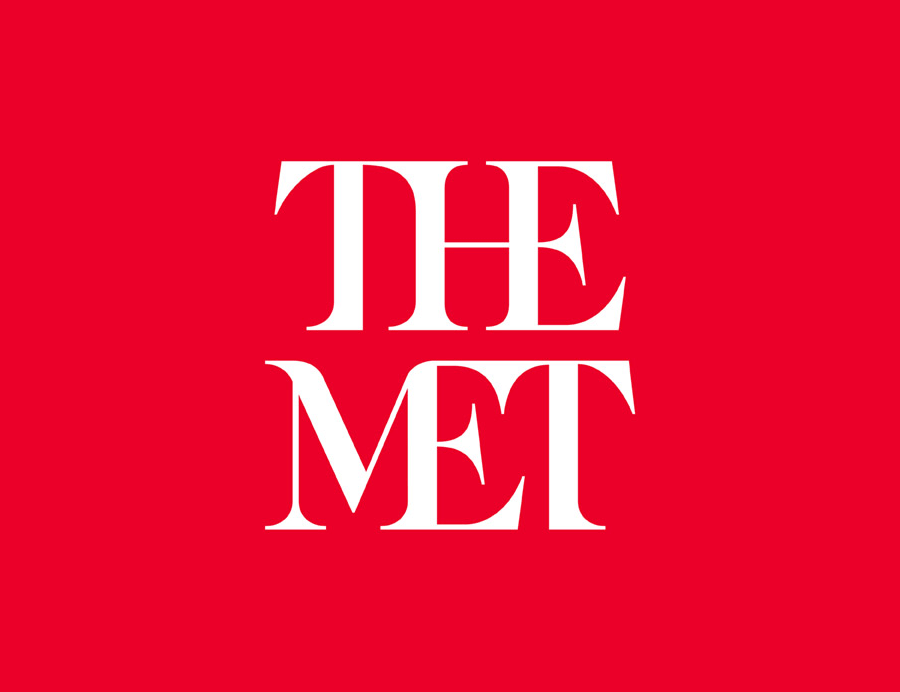
I produced a lot of research around Wolff Olins during PPP1 as a notable design studio that I admired within the industry and identified as a studio that I aspire to one day work for. Building on this, I have been keeping a critical awareness of their building portfolio and up to date with their studio blog and current projects. One such notable project developed by the London Studio this year has been the re-deisgn of the Metropolitan Museum of Art, based in New York and is the largest western hemisphere.
A statement from Wolff Olins contextualises their resolution 'Our new logo no longer relies on symbols and, instead, is based on our commonly used name “The Met,” which has an immediacy that speaks to all audiences. It is an original drawing, a hybrid that combines and connects serif and sans serif, classical and modern letterforms. In this respect, it reflects the scope of the Museum’s collection and the inherent connections that exist within it.' At release the new identity was highly criticised for its sharp connected hybrid however I find the logo refreshingly vibrant, the bold red adds a contemporary feel which is important for museums to battle against their prescribed conventions, paired with the hybrid serif connoting its sense of history and authority. To me the hybrid symbolises the museums holistic nature of all the collection that come within it. The bold creative nature of Wolff Olins is one of the qualities I admire about the studio, never playing it safe, always fearless combined with thoughtfulness that results in their ever expanding portfolio of industry leading design. The main aspect I feel is successful within the re-brand is that its got people talking about it raising its publicity. Without thinking too much into it, I like it, iknow others don't but thats the beauty of design and personal interpretation and perspective that is unique to ones own practice.


No comments:
Post a Comment