
Business Card
I felt a business card was in integral part of my self branding as it would often be a clients first interaction with me and my personal brand. Therefor I felt my business card needed to make a good first impression that reflected me and the high quality of my practice. I wanted to amalgamate all the features I have create thus far into one business card design. I established that it needed to be simple and contemporary with ample amounts of white space similar to the Artvvork branding I was inspired by during my research. I aim to use the display logo I created on the front of my business card design as I feel it is more engaging with the use of bight colours and creative textures that will appeal to an audience. This would then contrast the reverse design featuring my name slogan and contact information, I want to create an effective aesthetic simplicity to the reverse of my business card that also uses vast amount of white space creating a sense of continuity between the front and back of the card.


 |
| Final Front Design |
I started by developing the front of my business card design. I placed the display logo central and a clean minimalistic white background as I felt this would be affective in drawing the eye into the business card and also avoiding making it too garish with the use of a background colour. I then experimented with a range of placement settings for my name and slogan however after receiving feedback from tutors and students I found that the most effective design was using the simplicity of the logo by itself with no text. Students thought that the logo was engaging enough to stand alone and felt text overcomplicated the balance of the design. I agreed with the feedback and thought the use of the logo in isolation created an engaging enigma for the audience and felt ensured their full attention is directed to the contemporary display logo.


 |
| Final type alignment |
I then started to typeset my name and slogan in a sophisticated format that could be used together for letterheads, business cards and social media. I wanted the typeface to compliment one another and work well as a set between the body copy and display type. I started by firstly experimenting with range of ideas and found that lower case worked better fro the slogan as it looked more sophisticated and less harsh on the eye. I then started typesetting this with more detail aligning the slogan with my last name and adjusting the kerning accordingly so they both worked well together without compromising there legibility. Finally I experimented with the slogan's ascenders cutting into the titles descenders to create a tighter more customised design however from feedback students found this too close together and opted for the design with the ascenders of the slogan starting at the terminal of the 'Y'. I agree with their observation as in retrospect I think the overlapping of ascenders/descenders could affect legibly if reproduced in a small point size.

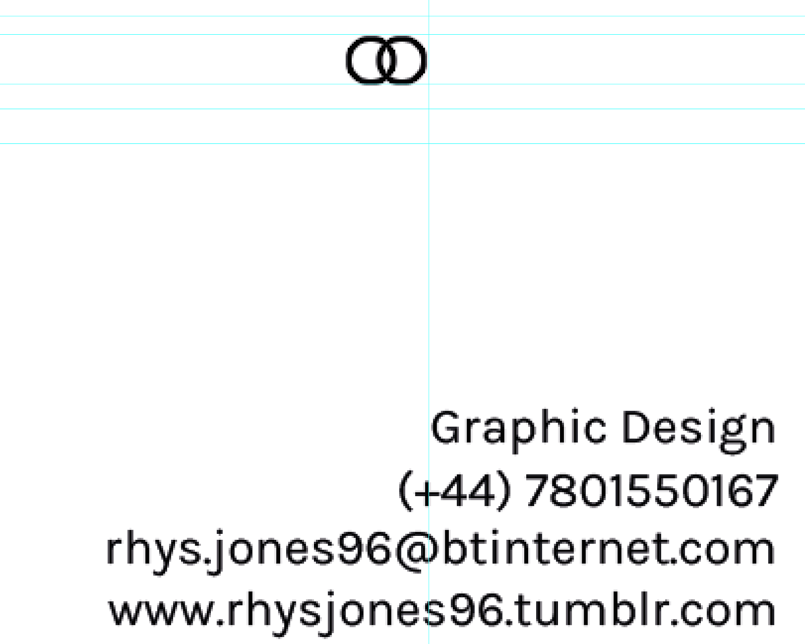
When experimenting with the composition of my back design I had an idea of the style I wanted my outcome to have in my head. Taking inspiration from the Business card analysis I did as part of my research I found that the information needs to be clear legible and not overcrowded. I wanted to keep the consistency of ample white space and a clean contemporary design that I had applied the the other elements of my self branding to create a consistent contemporary aesthetic to my design. I started by placing my newly formed type alignment with the ascenders of the title in line with the centre of the card I felt placing the type just below half of the page would be effective as it is in clear line of sight. I then placed my logo within the design to create consistency with the front design. I then aligned this with the x-height of the title and the start of the information as this gave it room to breath so that the design did not look too compact/cluttered.

 |
| Final Back Design |
When printing out mock ups some members of students evaluating my design felt that the logo on the back design was too small to see at a glance. reflecting on this I felt they had a valid point so decided to increase the size of my logo to fit within the x-height of the title and the baseline of the slogan this made the logo clearly visible and coincidentally made the weight similar to that of the title which I felt worked well. To make this re-sized logo hanse with the other aspects of the back design I realigned it with the start of the contact information which I feel balances the whole design nicely. Finally I changed to contact information to include a Behance account as opposed to a tumblr profile, I felt that a bechance account would be a more professional way to present my work to clients as tumblr has more social connotations whereas bechance is perceived as more professional. I feel as though bechance is the most appropriate way to present my work at this point in time as due to the high volume of college I feel as though I would not have time to build and maintain a professional website.
 |
| Final Business Card Design |
I feel that overall the design of my business card works well as the front displays the bright eye-catching design of my logo variation, that is aesthetically pleasing with an engaging texture from the brusho ink that I feel will make the audience want to look closer and engage with the card rather than putting it straight in their wallet/pocket.The reverse design is minimal and contemporary with my name in bold the bold display face supported by the creative slogan that reflects my diverse practise. In the bottom right corner is the key contact information and link to my online portfolio. I have kept the design minimal and have efficiently used white space consistently over both faces of the card to create a contemporary business card that I feel would impress a potential client and reflects myself and my practise consistently.
No comments:
Post a Comment